Pantone 2017! It ain’t easy being green!

The long-awaited day has finally arrived and here you have it Greenery 15-0343, Pantone’s 2017 colour of the year.

I don’t even know where to even begin with this one!! I think the general feeling about 2016 is let’s move on and get a fresh new start for 2017, and this colour will definitely send us in that direction. Greenery gives us endless possibilities with so many different applications and colour palettes!! Its just one of those colours that can blend into any style of space.

Continue reading “Pantone 2017! It ain’t easy being green!”

How to Shag!

Mad Men set – Interior Design Magazine

In the 60s, shag rugs began to surface.  The TV show Mad Men has one designed space that blows my mind. The bohemian vibe, and shag rug over high pile rug make me feel a little nostalgic for the 70s, when this was all the rage, I am pretty sure one can link the rise of asthma with the popularity of these rugs.

Continue reading “How to Shag!”

Pillow Paralysis? How to choose toss cushions!

You ever flip through a magazine and see a sofa with ten toss cushions on it and think “Wow! How did they do that?”

Here’s a couple of tips for you:

In spaces where you have one accent colour, and you want that colour to really play a part in your design, use multiple patterns, textures and shades of that colour in your cushions.

Continue reading “Pillow Paralysis? How to choose toss cushions!”

Be a Clever Homeowner

To renovate or not to renovate? Well, let’s look at some stats, shall we? This is an average of what you will get back if you renovate.  To be honest, it’s very timid. In my experience, kitchens and bathrooms bring you almost 100% return on investment. AND, the overall value of your home goes up if it’s awesome as opposed to okay. AND, you sell quicker, much MUCH quicker. AND, 1 last thing….renovations should end up costing you less than moving. We are booked with renovations consistently all year round. It’s great for business. So why am I so angry???

Continue reading “Be a Clever Homeowner”

Dare to be YOU!

Well, let it be said that design occasionally reflects on past trends (dreaded stirrup pants and neon pink t-shirts), but design’s true calling is moving forward: bigger, bolder, inspired and, well, ALIVE, to be honest.

With so many designers being focused on greige the last few years, it is a welcome breath of fresh air that Pantone has released some awesome, bright and, dare I say, happy, forecasted colours for 2016.  Not one greige in the deck.

Continue reading “Dare to be YOU!”

Let the Wall Come Down! A Kitchen Renovation Story

The Yonge Lawrence Kitchen

It was inevitable. They renovated their bathroom, see https://www.monacointeriors.ca/portfolio/yonge-lawrence-bathroom/  and the kitchen was to follow a couple of years later.  They had called a few times, we had looked at it and discussed their options and their budget, and then, when they were ready, they pulled the trigger. And what a journey we took!

Continue reading “Let the Wall Come Down! A Kitchen Renovation Story”

Cheers to the 2015 Colour of the Year!

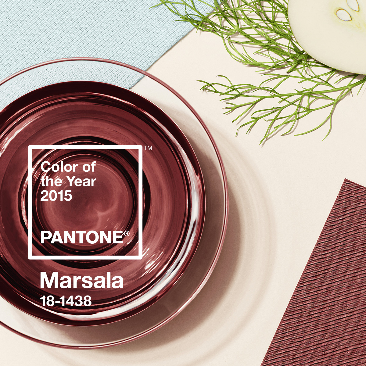
I’m always game when the world of design moves in the direction of good wine.  What?  Oh, sorry, did I write that out loud?  Marsala, a wine produced in the region surrounding the Italian city of Marsala, AND, the Pantone colour of the year (#18-438).  An earthy brownish-red that is described by Pantone Color Institute Executive Director Leatrice Eiseman as “nurturing and fulfilling…Marsala is a natural fit for your kitchen or dining room, making it ideal for tabletop, small appliances and linens throughout the home.”

Continue reading “Cheers to the 2015 Colour of the Year!”