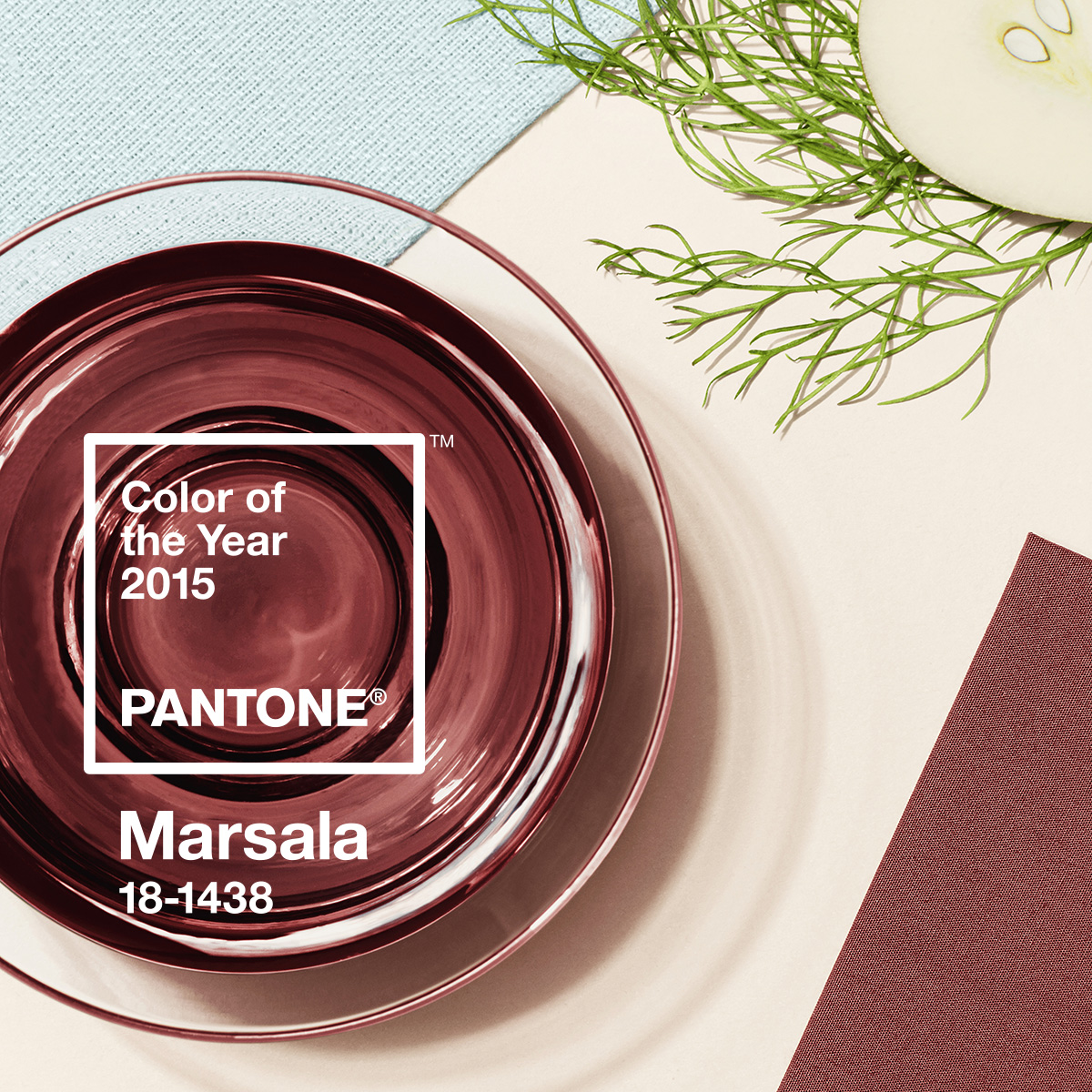
Cheers to the 2015 Colour of the Year!

I’m always game when the world of design moves in the direction of good wine. What? Oh, sorry, did I write that out loud? Marsala, a wine produced in the region surrounding the Italian city of Marsala, AND, the Pantone colour of the year (#18-438). An earthy brownish-red that is described by Pantone Color Institute Executive Director Leatrice Eiseman as “nurturing and fulfilling…Marsala is a natural fit for your kitchen or dining room, making it ideal for tabletop, small appliances and linens throughout the home.”
That’s it? NO WAY! It’s an amazing colour. Filled with the true essence of warmth and nature, sophistication and timelessness, this colour is definitely making my 2015 a very exciting year.
Modern Marsala
Think clean lines, awesome colour, lots of light. Using Marsala in a modern space, against white walls, or light gray furniture creates a warmer effect to a colder modern design. Funky white Butterfly chairs, as in the image below, against the contrasting wall shows off the chairs lines, and keeps things interesting without going overboard. The key in more modern design is to keep the “accent” colour blocked, such as an accent wall, some toss cushions, or a pop from a smartly hued coffee maker. It’s about less is more. One accent colour made contemporary by its simplicity in the space.
Exotic Marsala
This is where Marsala really shines. Think Moroccan, Indian, saffron, wine. Think layers of lush fabrics that scream “yummy” and beg for hits of golds, aubergines and chocolate browns. Velvet fabrics, kilm rugs and luscious drapes. Makes me want to sit on a bunch of pillows, lean back on some low settee and sip some mint tea. Or, a very generous glass of red.
Earthly Marsala
Coming to mind is a night, in Algonquin park (my husband makes me go camping once a year….not a designer’s dream vacation, but inspiring none the less), when the sun is setting over the lake and the many shades of red promise a lovely morning. I even know the old song “Red sky at night, sailor’s delight. Red sky at morn, sailors be warned.” Sitting in the canoe, I look out and the dense forest around me is beginning to show signs of autumn, with richly coloured leaves, many the dark, earthy red that we are blessed with this year.
At home, pair it with wood floors the colour of tree bark, and chocolate leathers. Maybe invest in the new Husdson’s Bay Point Blanket in neutral grays as an accent that speaks Canadiana and Earthiness. Although, in all honesty, earthliness is a whole blog on its own…ranging from Zen to Cozy Cottage design. Here, though, the true gift of nature speaks volumes with this shade of red.
Pairing Marsala with Complimentary Colours, Fabrics and Textures
Here’s the Benjamin Moore version of Marsala, the same Pantone colour as is shown above. We’ve paired it with some cooler, easier shades, you can use two or three of these colours in a combination. Or, for the most dramatic effect, use this Cinnabar with white, or even Cloud White (CC-40), for a simple, modern take on this well-aged shade.
Accenting With This Years Hue
It’s so easy! Just a few toss cushions are enough. OR, go bold and amazing by using key furniture pieces to express this timeless shade. Even leathers can tint a little to the earthy reds…
Try some of these pieces and/or fabrics to shake things up a little!

The year 2015 is off to a great start. Cudos to Pantone for choosing a colour with depth, longevity and the much needed vibe of a true, warm, hug.
Have a terrific day!
XR
#marala #pantone2015 #jffabrics #westelm #design #interiordesign


