All the beauty of life is made up of light and shadow -Leo Tolstoy “Shadow”. It sounds so dark, exotic, sexy. It’s Benjamin Moore’s colour of the year. And it’s a good one. Can I be tacky for a second? It’s like an aged grape. Hints of gray, notes of neutral. A smoky, warm aroma. Goes well paired with a “dark burgundy” dressed with a pale “porcelain”. The muted shade honestly goes well with almost anything. I think a powder room completely enveloped in this shade would be dramatic and rich. While I am pretty much done with painting a feature wall (wallpaper and plaster finishes are much more inviting), I could imagine a staircase cove, or library. This photo by Benjamin Moore displays it perfectly. A slightly brighter tone of this colour, would be amazing as a velvet sofa. How luscious would you feel lounging on this? Wallpaper, as I often suggest! One here, uses golds to offset the darker grape hues. It’s modern AND classic in design, and injects the colour without over-committing. The second wallpaper, a complimentary shade. Imagine using this one a wall, and shadow on the ceiling. Talk about an intense and dynamic paring! […]


Well, let it be said that design occasionally reflects on past trends (dreaded stirrup pants and neon pink t-shirts), but design’s true calling is moving forward: bigger, bolder, inspired and, well, ALIVE, to be honest. With so many designers being focused on greige the last few years, it is a welcome breath of fresh air that Pantone has released some awesome, bright and, dare I say, happy, forecasted colours for 2016. Not one greige in the deck. It’s a designer’s dream. It truly is! FINALLY, something awesome to play with! It’s like giving a kid a million dollars and letting them loose in a candy shop. And not some variety store, but like a serious, of Disney proportion, candy shop. But alas, what to do? More toss cushions? I might be sick if one more person puts twenty different toss cushions on one sofa and calls it good design. Are we not bored of toss cushions? White walls, greige sofas and twenty toss cushions. Just add in a white kitchen with a black island and your house will look just like everyone else’s house! So let’s inject some personality into our homes. They are our homes, after all. Let’s stand […]

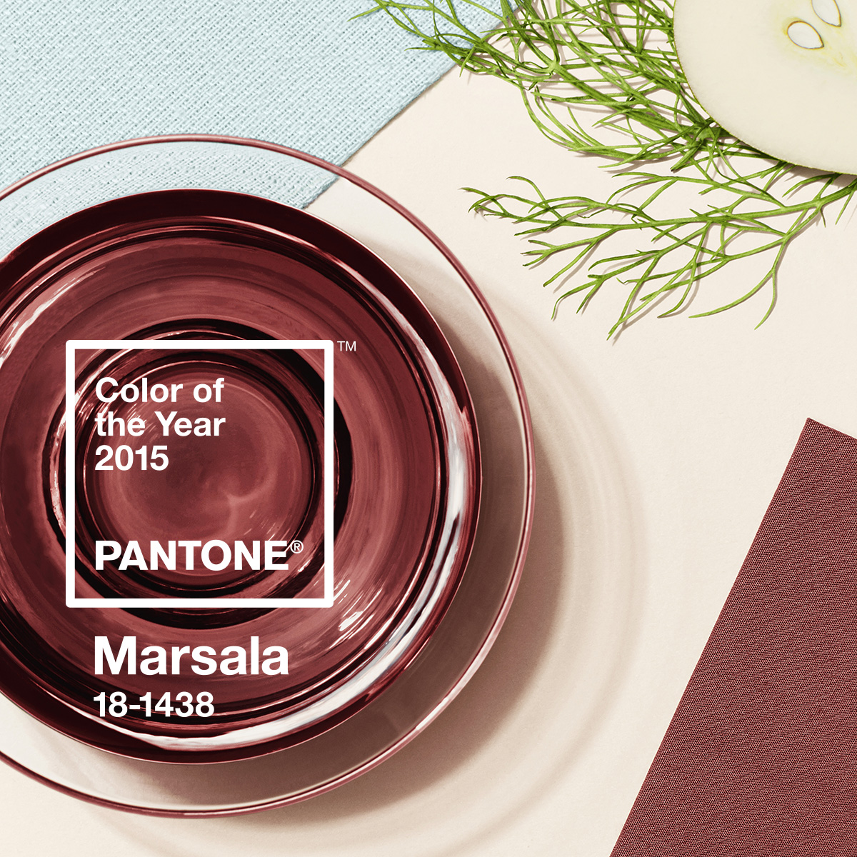
I’m always game when the world of design moves in the direction of good wine. What? Oh, sorry, did I write that out loud? Marsala, a wine produced in the region surrounding the Italian city of Marsala, AND, the Pantone colour of the year (#18-438). An earthy brownish-red that is described by Pantone Color Institute Executive Director Leatrice Eiseman as “nurturing and fulfilling…Marsala is a natural fit for your kitchen or dining room, making it ideal for tabletop, small appliances and linens throughout the home.” That’s it? NO WAY! It’s an amazing colour. Filled with the true essence of warmth and nature, sophistication and timelessness, this colour is definitely making my 2015 a very exciting year. Modern Marsala Think clean lines, awesome colour, lots of light. Using Marsala in a modern space, against white walls, or light gray furniture creates a warmer effect to a colder modern design. Funky white Butterfly chairs, as in the image below, against the contrasting wall shows off the chairs lines, and keeps things interesting without going overboard. The key in more modern design is to keep the “accent” colour blocked, such as an accent wall, some toss cushions, or a pop from a […]

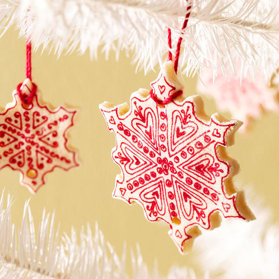
I love doing crafts with my kids. And holiday season gives me lots of opportunity. I also find that it helps me my “control freak” a bit of a break. I mean, there is no way 5 year olds are making perfect ornaments with straight lines and pretty lettering. So it’s a free for all with lots of shiny stick on thingys and crazy paint patterns, and some painted shiny stick on thingys. And once we’re all done, the kids get to help me hang them up. What a joy it is to see the pride on their faces. The best part? Well, when company comes over, everyone gets a guided tour of the decorations and who made what. It’s a veritable tourist attraction! I start early, putting my decorations up so they’ve got a month of ‘show time’ before packing them up again. And every year, we make some more. We keep the best of the lot for ourselves (yes, we’re greedy), and then we give them away as little gifts for friends and family. It’s a tradition in our home. We do the same with cookies too (the kinds you can eat). I sort of wish that […]

Decorating for the holidays is: Fun? Daunting? Mystifying? Stressful? Got a mixed up family full of: Hanukkah? Christmas? Kwanzaa? Newtonmas? Festivus? Wanting to make it: Classy? Fun? Youthful? Colourful? Taseful? Cheery? Cozy? Oy. My head hurts too. So let’s simplify a little, shall we? I grew up in a Jewish home. Super envious of my bestie down the street, whose dad was a minister and whose Christmas seemed glorious! And, as the years passed, they invited me for tree trimming…I remember all too well having to figure out where the fake limbs went years after their colour coded stickers had fallen off. There was always a little gift for me under that tree. And I even got to go to the church a few times and listen to all the beautiful songs. It was amazing. And at my place? Hanukkah was a bit more, um, chill? Gifts: Check. Doughnuts: Check. Menorah with candles: Check. That’s it. BO-RING! So now that I’m a grown up, with a hubby and some kiddies and my own home, that Hanukkah celebration has reached for the stars!!! And here’s a little of how I get my holiday decorating in order: Your Colour Choice I’ve seen […]

For how many years have we been swarming silver tones? Chrome. Nickel. Stainless. Platinum. It’s been a decade? At least. Well, it’s finally time to warm up and get some classic back. Gold is making its comeback. Some of it is still brassy…but most of it has that satin or brushed finish that’s, well, simply divine. I heard a designer recently comment, “Gold has gone from shiny and brassy to satin and sassy.” Wish I could remember his name. What a stellar remark. And it’s true. We’ve grown up since our super gold glow days, into a more sophisticated bunch. We no longer want that ‘in your face’ gold. We covet the warmer tones of these new golds, and it’s popping up everywhere from jewellery to light fixtures and furnishings. Let’s look at some of my current favourites. Jewellery Since we’ve spent too many hard earned dollars on platinum and silver, one wouldn’t dare go totally gold, for risk of the dreaded ‘clash’. So what better way to mix and match than to start with a ring that combines the two tones! These awesome rings by MeditationRings combine golds and silver in unique ways. Spinning […]

Paint above: Benjamin Moore Welcome to the new age of design. As the new generation starts to move into their new homes, condos, apartments and swanky lofts, they long for something different than what they grew up with. They want to spread their fashion wings, and let their individuality shine. We spent most of the 80s and 90s saturating homes in greens and burgundies. One of my first jobs, as a designer, was to help a client who spent a fortune on a turquoise leather sofa in the late 80s. Yes, you just read that. The millennium arrived, and as my amazing faux finisher/decorative painter Suzanne Pratt of Venetian Studios rants, “boring, blah, beige, took over!” So here we are. Most of us, are sickened at the thought of hunter green and deep wine, and bored with white and beige. So, in efforts to help us out, the world of design is giving us BLUE! And, just in time for summer! Blue, as a “staple” colour, is a leap for most people. A blue sofa? A blue dresser? A blue rug? Really? It’s not just an accent colour? NO! If you are one of those people who has been […]

Any designer will tell you, they have a secret obsession with the accent chair. Accent chairs offer us easy and fun ways to fill little empty spaces, create punch in an otherwise boring room, use our favourite fabrics, indulge in a sculptural piece, or repurpose the cutest, sweetest, possibly not even usable, old chair that we can live without. But the insistence that every chair in your house must serve as seating holds us back. As does the misconception that your chairs must “match” your sofa, or your entire dining set. Think of it this way. An accent chair can be purposeful or just visual, funky or vintage, cheap and cheerful or expensive and luxurious. Here are some of my top picks for this season! Define your space: A living room does not have to conform to a sofa, loveseat and wing chair combination. Creativity is paramount when defining space. Remember too, when company is over, people would prefer to sit in a chair, than be the person in the middle seat on a sofa. Here, you see the building of the rooms character with two bold green chairs, and two fantastic printed chairs. The conversation area is defined, […]

Newport style defined: classic design that lends its origins to Newport, Rhode Island, a seaside city along the east coast of the United States. The city boasts beautiful sunsets over the Atlantic Ocean, and is well known as a summer resort destination. Not as beachy as Cape Cod, or neon as Miami, Newport has its own niche style. A style that has been coveted by today’s homeowner. But it’s not super easy to create a space, in Canada, that reflects the vibe of this lovely city, while not looking like you’re trying too hard. Design that looks too conspired never truly feels like a comfy home. And if nothing else, Newport style is comfy, calm, organic and natural. Maybe even a little, teensy bit, Ralph Lauren. Trying to recreate this style, a few degrees north, isn’t very complicated, but it’s a commitment. You can’t just do it “a little”, you’ve got to be all in. I personally love the look. It’s pretty timeless, and easily acquired if you stick to the design ethic, and promise not to use boat rope to wrap a light fixture or table base. Try sticking to three or four colours. Maybe go with a […]

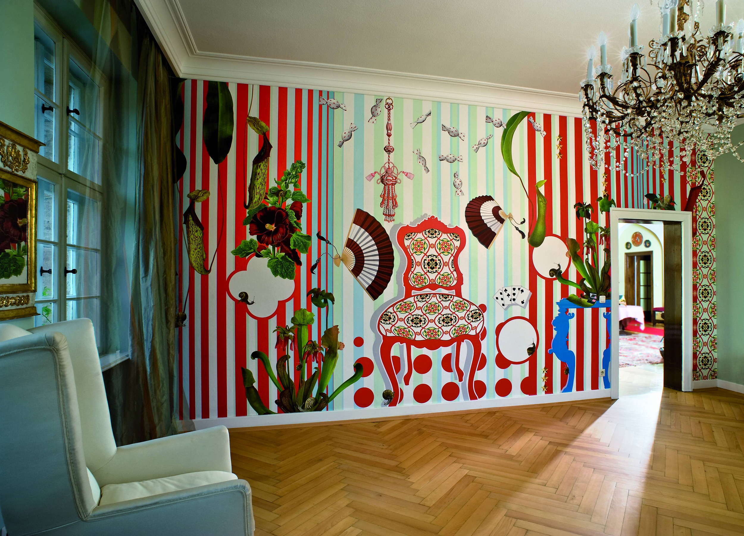
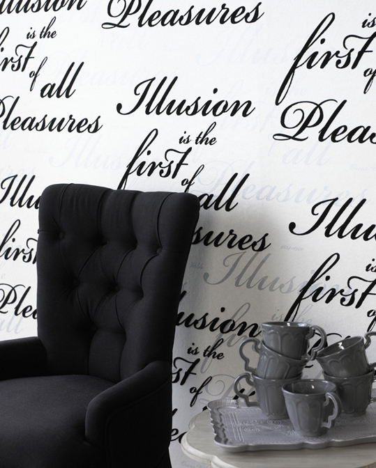
It’s back! It’s been back for quite a while, and although most of us associate wallpaper with the 1970s velvet flocked granny papers, modern times have propelled wallpapers into the future. No matter your design ethic, wallpaper can add anything from some simple texture, a splash of colour or an artistic element. Use it to complete your design, add sophistication or even frame it as an inexpensive, yet unique, piece of art. Super thank you to Joanne Fabrics (www.joannefabrics.com) for these great wallpapers, and for providing Monaco Interiors will all the books for our clients!! Let’s look at different styles and how wallpaper can be used to enhance a space. Cottage/Vintage Chic Pretty wallpaper, in either a neutral as shown, or a lovely shade of your favorite vintage inspired colour, can really create the look you are after by acting as your jumping off point. Here we can see that the paper used initiates the colour palette, and instantly gives the homeowner that cottage chic, almost French inspired look. Add some feminine furnishings, and there you go. Design done. Un fait acompli! (means job well done) Hollywood Glam Going black and white is a classic, Hollywood inspired design concept. […]